Wednesday, 13 January 2010

Final production and ancillary tasks

Final production


Radio trailer


Print advert


Evaluation Question 4

How did you use technology in the construction of your product?

Research

I used Microsoft Word to compose the questionnaire in order to find out what would attract my target audience to my documentary. I also used it to write up the running order for my documentary.
Microsoft Excel was used to create the graphs of the results from the audience feedback, so that the group could see clearly what things we might need to include in our programme.
In class we used a DVD player to watch and analyse three different documentaries, helping us recognise that nothing is done by accident when filming a documentary and it also helped us to put new terminology into place.
Whilst at home I analysed a further two documentaries using a television to continue gaining insight into different methods of making them.
I also used a mobile phone to video some our audience feedback.


Planning

When planning I watched multiple different videos once we had decided on the topic for our documentary in order to look at different ways of producing a documentary on graffiti.
I used lots of different websites to find suitable archive material for the programme and also to find out some history about the topic.

Production

A digital camera was used throughout the prodcution of our programme for various different things. These included:

- Taking pictures of archive material

- Taking still images of graffiti

- Taking pictures of each other filming

The video camera was the most important piece of equipement used. It was used to film all of our interviews, establishing shots, shots of graffiti and chromakey background. We were as creative as possible when using the camera in order to make the programme interesting.

We used Adobe Premier Pro in the editing stages of our programme to delete anything we didn't need and to also make it look professional.

Adobe Audition was used for the creation of our radio trailer for our documentary.

Adobe Photoshop was used for the creation of our print advert which would appear in a newspaper to advertise our documentary.


Monday, 11 January 2010

Evaluation Question 3

What have you learned from your audience feedback?

We conducted a group audience feedback session. We asked our audience about:
- Technical aspects
- Camera work
- Sound
- Editing
- Content
- Strengths
- Weaknesses
- Compare to professional products

The majority of our audience felt that our use of camera work and music fitted well o our production. This was because of a variety of camera shots being used, which were also creative. Some of the audience also commented on the low angle shots used on the buildings and that the hip hop music fitted the shots of graffiti along with the pipe music fitting the history section.

People had different opinions on their favourite section of the documentary. The majority varied between, the interview with the graffiti artist, the cross cutting between the head teacher and police man and the vox pop. The audience found all of these entertaining and fun to watch.

The audience commented on some of the weaknesses in the programme. Such as there not being enough audio gain in certain parts of the documentary where the voice over was. Also some of the audience felt that the betoven music used in the background of the black and white section didn’t fit the genre. Another weakness which was commented on was that our documentary would be more suited to a younger audience mainly because we interviewed a young graffiti artist.

The majority of the audience said they would watch the full 30 minute documentary. They felt that the strengths in the content were the history, and the interview with the graffiti artist.

When comparing our documentary to real media products our audience felt that it was edited professionally, the graphics worked well and it was edited very professionally.

The majority of our audience felt that our radio trailer advertised our documentary well because it teased and made them want to watch it. The audience also felt that the print advert linked well to the documentary and was a good sum up of it.


Shanny, 30 "The best part of the documentary was the interview with the graffiti artist because it was interesting and the images in the background looked good."


Angela, 42 "I didn't feel that there was enough audio gain used in certain parts of the voice over but overall the editing was professional and it compared well to real documentaries."

Olivia, 38 "I liked the first five minutes of the production because it was intruiging and I found the debate interesting"


Joan 59 "I like most of the production, however I didn't think that the music went well with the black and white part of the programme"

James, 32 " I would definately watch the full 30 minutes of the programme and I thought the camera work was good through out, especially on different shots of buildings"

Jamie, 40 "I would definately watch the full thirty minutes of the programme because I would like to gain more insight into the topic as I am unfamiliar with it"


Al, 56 "I thought that a strength of the documentary was a use of creative camera work and a weakness was that may be it would be suited to a younger audience."


Andrew, 34 "The radio trailer is good because it tells the audience when to watch it and makes the show sound itneresting"

John, 58 "I thought the radio trailer advertised the programme well, it sort of teased the audience on what it was about"

Chloe, 35 "I think that the print advert was very creative, although simple"

Tracey, "The print advert definately advertises the programme well, however some parts of it were a bit quiet"

In conclusion, to what we have found out from our audience feedback that I have gathered are, most of our target audience made a comment about the black and white feature of our documentary, which shows it was a success in trying to make an interesting part in the programme.
Some of our the target audience commented on the fact that the documentary might also be suited to a younger audience, this may suggest that we could make our target audience a little wider.
There was various different parts of the programme which were commented on as good content, showing that what we did was a success and there wasn't just one good part but many parts.

Friday, 8 January 2010

Evaluation Question 2

How effective is the combination of your main product and ancillary tasks?


If the audio clip I have uploaded does not work the script for it is typed below:

"In my documentary I have created coherence throughout between the first five minutes, print advert and radio trailer. This has been done in a variety of ways, the main way being the use of the title in all three texts. The title features at the start of the programme, and is also the largest feature on the print advert. It is also featured when the voice over gives the audience the scheduling of the programme in the radio trailer.
The print advert coheres well with the opening titles of our programme because it is the same image making it recognisable for the audience. As we had to sum up our whole documentary in one picture, we decided not to create something unfamiliar to our audience but to use something that they would see and instantly recognise and remember. I am certain the audience would remember the image because it is effective.
The voice over also reinforces the link between the documentary and the radio trailer because it is consistent throughout. It is my English teacher and he was chosen by our group because he speaks Standard English and fits into our target audience. In the radio trailer similarly to the documentary hip hop music is used to create coherence because it fits the genre of the programme.
The radio stations which our radio trailer would feature on are as follows; Real Radio, Absolute Radio, Heart, Magic, maybe on Classic FM to gain the older end of my target audience, Planet Rock. Our documentary couldn’t be broadcast on any of the BBC stations as it is not made by them.
The print advert would be placed in papers such as The Guardian, The Independent, The Express, The Mail. This is because the audience for our documentary is aimed at the more middle class and therefore would read papers such as these. "

Wednesday, 16 December 2009

Evaluation Question 1

In what ways does your product use/develop/challenge forms and conventions of real media products?


I believe that the documentary, radio advert and print advert do not challenge the codes and conventions of real media products. I have followed all possible conventions in hope of creating a professional looking media.

To demonstrate how I have done this I think the best way would be to compare my documentary to real media prodocuts.

Framing:


The top screen grab is from my documentary and the bottom one is from the link below:

http://http//www.youtube.com/watch?v=5iHgbvmSeuI

The framing in both of these interviews have been filmed in medium close up and are both aligned to one side of the shot with a looking space for the interviewee. In both shots the eye line of the interviewee is roughly one third of the way down, following convention.


Graphics:


The screen grab from the left is from my documentary and the one from the right is form the link below:
http://http//www.youtube.com/watch?v=_I9-XxBAEsQ

Both of these onscreen graphics follow documentary conventions as they are on the opposite side to the interviewee and they also give the person's name and anchor their relation to the subject. There is also a use of simple, white typography and the top line font is bigger than the bottom.


Cutaways:


INTERVIEWEE


CUTAWAY


INTERVIEWEE


INTERVIEWEE


CUTAWAY


INTERVIEWEE


The top set of screen grabs are from my documentary and the bottom set are from the link below:
http://http//www.youtube.com/watch?v=5iHgbvmSeuI

In both shots the questions ahve been cut out of the documentary and the interviewee is talking directly about what the cutaway is showing.

Conventions of radio and print adverts

Codes and Conventions of Radio Trailers
Title and scheduling usually at the end of the trailer
Channel name is prominent (last thing said), day and time included
Music bed usually used underneath
Extracts from programme - snippets of interviews - Key element (actuality footage)
Voiceover outlines narrative, poses question (which will be addressed in programme), Used to tease audience (sometimes), appropriate to programme
Usually 30-40 seconds long.


Codes and Conventions of Newspaper Adverts
One strong image
slogan but words kept to minimum
scheduling info
channel logo prominent
I researched posters and adverts on this websire below that makes the advertising for C4.
http://www.4creative.co.uk/flash/#/print/press_and_poster/

Editing

To do edit our documentary we used Adobe Premiere, along with Adobe Audtion to create our radio trailer.


The first thing we did in the editing process was capture out footage and use logging sheets to write down each shot and whether we thought it to be useful or not. One of tapes was damaged by accident and as a result we lost a couple of shots but this didn't effect our five minutes. The interview with the police man was also lost due to school network problems but we found it after two weeks and proceeded to use it. The capturing process was finally finished and we were ready to begin editing.


We began editing our programme in chronological order and trying as best to follow our running order.There were a few changes made from the running order for example the spinning shot in the graffiti studio wasn't used as it wasn't what we were expecting to find. Also the interview was supposed to be with Michael Hoey, however this later was changed to Matthew Vaughn another graffiti artist.


Choosing the shots we wanted to use was fairly easy because we set out to film especially for our running order and so we didn't have any problems with the amount of footage. Shots of graffiti were used for the first 3 main parts of the programme as cutaways, background of the chromakey and actuallity footage.


We used three different effects in our documentary, these were fades, to make pictures look more interesting, dissolves for the same reason and a black and white effect to make graffiti artists at work look more dramatic.


The most difficult part of the editing process was perfecting the chromakey. Choosing the shots and cutting out the questions and choosing cutaways was easy but when applying the shots the background it became complicated. This was because the clips had to be perfectly inline with the end of the question. We managed to get everything in line after a few attempts.


After we had completed the five minutes and set up the timeline we added in the graphicd for our interviews. In order to follow convention we used a white font and the name was bigger than the person's relation to the subject.


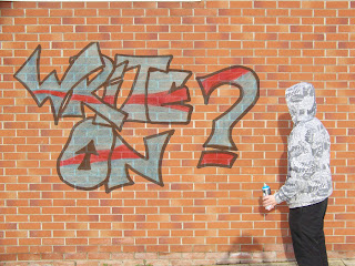
One of the final things we did was edit our opening titles because we couldn't decide properly as a group. We sped up parts of it in order to fit the sound track and scanned in an image of our title in graffiti which we edited in photoshop as slightly dissolved in order to see the brick work through.


The final thing we did in the editing process was add the music tracks to our five minutes. Jon brought the tracks in recorded from home and we chose the final tracks we would use. Adding them was fairly simple and getting the sound levels right was quite easy. We used the keyframes tool on 'Premiere' to fade the song down at points, when we added in our voiceover and also at the end of shots.


We recorded the voice over in the radio studio and then had to increase the audio gain to make it sound better, overall it was an easy process and quickly done.


The editing process went well overall and was enjoyable, any problems we came accross were fixed.